Sunday, February 01, 2015
Friday, August 02, 2013
Thursday, March 07, 2013
Shadow Weave Chenille Scarf
 |
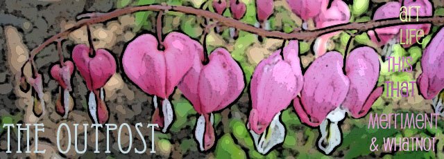
| Art Outpost: Shadow Weave Chenille Scarf |
Finally finished this shadow weave scarf! It's not that I've been working on it steadily ... there have been a few other projects in between ... but it had been going at rather close to Snail's Pace.
There was plenty I didn't understand about how best to work with chenille yarn. The first mostly successful attempt at weaving with chenille was evidently a lucky break, and everything that could go wrong went wrong this time, beginning with winding the warp and ending with ... oh ... completely starting over again ... the second time with the indispensable help of Su Butler's CD version of her book Understanding Rayon Chenille.
What makes the shadow in shadow weave are the alternating "dark" and "light" threads in warp and weft ... in "the Atwater method of threading shadow weave, the basic pattern is drawn on alternate threads and then the "shadow" threads are filled in on the "opposite" shaft." That explanation is straight from A Weaver's Book of 8-Shaft Patterns, and the pattern used for this scarf is an "undulating twill" (#303 on page 77).


I still have trouble getting the fringes right, though I seem to be getting closer. Here's my old Riverside Shakespeare put to good use weighting down the scarf so I can evenly tie the knots. The gadget on top of the book is a novelty instrument made for twisting hair, and it works a treat for twisting fringe (actually a lot easier than trying to twist my hair). I'll need more practice to figure out exactly how much to twist and then retwist the opposite direction ... it's supposed to be exactly the same number, but I haven't figured out yet how to accurately count while using this device. I'm guessing this is why some of the yarns in some of the fringe doubled up and tangled with each other at the fell line after taking the scarf out of the dryer.

It's quite remarkable the difference in the hand and softness of the chenille after it's been wet-finished. It comes off the loom as stiff as a board, and after it's been washed and dried it's soft, supple, and very luxurious. (The scarf on the left is post-finishing ... impossible to convey the difference in a picture, but it definitely looks velvety.)

Just by changing the treadling of the same draft you can get a completely different look. The sample on the right will be the pattern for another scarf (same threading and tie-up, different treadling order) in a brighter red and black yarn instead of gray. With any luck, this one will go a lot faster and will not involve too much in the way of cursing and wringing hands.
Friday, January 25, 2013
Word as Image
Illustrations from Ji Lee's video Word As Image.
The whole alphabet, complete with sound effects, is here.


Wednesday, January 09, 2013
The ABC of Architects
The ABC of Architects from fedelpeye on Vimeo.
"The ABC of Architects, an alphabetical list of the most important architects with their best know building directed by Federico Gonzalez and animated with Andrea Stinga."
Well, this is cool. I even recognize a few of the buildings.
via notcot.org
Tuesday, January 08, 2013
The Book Club of California Centennial

The design for the centennial celebration of The Book Club of California via Felt & Wire.
I am completely charmed by the idea of a book club devoted to the love of the printed book, whose members include artists, collectors, and printers. If you're one of the 1000 members you receive a letterpress printed "Quarterly News-Letter" ("QN-L" for short) and other exclusive printed perks. Sweet.
The claim is that the newsletter is the only letterpress printed newsletter in the U.S. There are pictures of various covers of previous newsletters on the site, and a notice that some issues can soon be read via a PDF.
This logo was designed by designer Michael Osborne, and I took particular note because I just designed, in my own bumbling Illustrator way, a similar rectangle as a return address for myself.
Thursday, November 08, 2012
Lazy Jane's, Lazy Day ...

Went to lunch with a friend today at one of my favorite spots, Lazy Jane's. (I don't think this particular piece is there any more - it's a vintage metal kinetic toy). Afterwards we took a stroll down the street and popped in at Hatch Art House, where among lots of other cool things we were amused by the paper mache work of Steve Wirtz. They were mostly dogs, with a few cows thrown in, very ... personable. Usually with a sassy sentence or words collaged on their sides. It seems that one can sign up for classes to make your own sassy dogs ... that might be quite fun.
Tuesday, May 29, 2012
In search of the perfect lemon bar . . .

This one by Ina Garten comes within striking distance, but I'm not all that fond of the thick crusty top. Overall, though . . . pretty divine. I think I'm looking for a recipe that doesn't have that crusted top, but also doesn't have that odd foamy effect at the top that requires the dusting of confectioner's sugar to disguise. I believe this recipe avoids that foamy top by using a larger amount of flour in the recipe, which seems to kind of float to the top in the way that Bisquick Impossible Pies works.
smitten kitchen suggests a few changes, including a variation for making a thinner lemon layer. I like the thicker lemon layer, but I wanted a thicker shortbread also, which proved to be harder than just doubling the recipe. I don't like the lemon layer to seep underneath the shortbread at the edges, so I doubled the shortbread recipe and built up the sides, but alas, as in the original, the sides tended to s-l-i-d-e down while baking. What to do? I think . . . though I haven't tried it yet . . . the solution lies in the recipe for pie crust I followed the other day, which was to bake the shortbread with an aluminum foil liner and plenty of pie weights (or dried beans). I'll just have to try it again. Too bad for me.
My tips, besides the pie weights for the shortbread (which can't really be a tip since I haven't tried it yet . . .)
1) Line the pan with non-stick aluminum foil (both ends) to simplify getting them out of the pan and cutting.
2) Allow to completely cool and refrigerate, preferably several hours, before attempting to cut them. It might even help to put them in the freezer for a bit if you're in a hurry.
3) Dust confectioner's sugar on them after they are completely cooled. If not having them
right away, you might wait until just before serving to dust as the bars will absorb the sugar over time.
In the meantime . . . still looking for the most perfect recipe.
Friday, April 13, 2012
To Sir, With Love

Latest movie on a sleepless night - "To Sir, with Love"
Best things about it:
Sidney Poitier. 'nuf said.
Lulu singing "To Sir, with Love" in the 60's.
How many times have I belted out that song in the car or the shower.
Lulu singing "To Sir, with Love" in the 60's.
How many times have I belted out that song in the car or the shower.
And here's a new-ish clip of Lulu singing the title song in 2008: Wow ... looking and sounding really great! But I'm curious about how someone doesn't get absolutely sick of singing one song for forty years.
Sunday, February 26, 2012
2011 Happened III

It appears that showing up at the end of the day on a Sunday is the
way to go. Imagine people winding up and down. They weren't there
when we were there! No pictures allowed in the exhibit, so what
follows are the non-exhibit pictures.

I do like it when there is art everywhere. This is the entry booth.

And this is the Mississippi River Visitor Center, just inside the doors of
the museum. And that's Melanie, standing on a map of the Mississippi
River Basin, printed right on the floor. Love that.


We didn't see a lot of the rest of the museum, as we were there pretty close
to closing time. A lot of the museum is geared towards small-ish children.
But this exhibit was tailor-made for me. Little automatons . . . many, many
of them. This tiger has a fish swimming around and around in his head
as he's typing.

Cat and cat puppet!

Right outside the museum, the other direction from the charming little square,
is the Mississippi River, complete with steam-powered showboats.


This is the view to the right of the museum on the way out.
Not picturesque in the same way as the charming square or the Mississippi
River, but after seeing this picture I love the lines and colors in it.
2011 Happened II
Yeah, the Mall of America.
It's good if you can get there when other people are not.
Good luck.

Checking in with the Lego Store from above is always fun.

Nickelodeon Universe. We didn't do rides this time.
The first time we (as in the two older daughters) were here was
when it was called Camp Snoopy and Peanuts characters ruled the day.


A restaurant inside the Mall of America that serves this outrageously
fabulous dessert called a S'more Brownie.
The restaurant is appropriately named Crave.

Headed for the Science Museum of Minnesota to see the King Tutankhamen exhibit.
We found ourselves in this little square just a block away from the museum.
The street was all brick cobblestones, and right next to the St. Paul Library and just
as charming and cute as all get out. And the parking was free that day to top it off.

This was the view across the square from our parking space.

every purple car we spotted. She made a good bit of money that way. (But not a lot!)

2011 Happened
I was telling a friend yesterday that 2011 was kind of a bust for me, which it
kind of was in certain ways,
but it turns out as I look back at pictures . . .
there were some good things that happened that year.
I cleaned out Studio I. Here is one of the "before" pictures.
(There are more, but I won't subject you to that. And the "after"
pictures will come later.)
It's actually a work still in progress, but much progress has been made.

I went to Minneapolis/St. Paul twice.
Once with my mom, and once with two of my daughters.
And both times I got to see my daughter and son-in-law who live in MN.
So that's a big 2011 bonus.

The most exciting thing I saw in Minneapolis was this statue of
Mary Tyler Moore flinging her hat into the air.
"Who can turn the world on with her smile.
Who can take a nothing day,
and suddenly make it all seem worthwhile . . . "

"You're gonna make it after all . . . "

Minneapolis has cool manhole covers. I once had 4th and 5th grades design
and paint manhole covers on pizza cardboard circles, and then underneath
the cover they drew whatever imaginary scene they wanted. I put them on the
floor of the hallway on "Back to School" night and people could lift the cover
on a kind of hinge I made to see the "world" underneath.

And stopping in at IKEA.
Wonder how many think that the toilets are not for display only.

Hot lunch! (and how many of you are thinking of the original "Fame" now?
No? Go here.)

Subscribe to:
Posts (Atom)